Grand Cypress — No Apologies

Sometimes lost in discussions about golf courses and sites and design is the understanding that golf is, fundamentally, a sport. We wield specialized equipment, wear standardized uniforms of a sort, and take what skills we have onto prescribed playing courts of roughly the comparable configurations and durations. With this in mind it’s not misguided to view golf courses as stadiums, manufactured athletic fields.
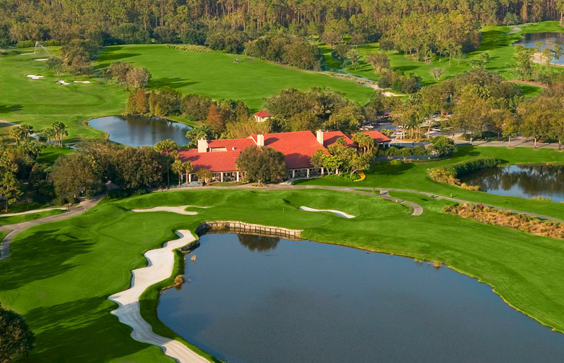
This idea obviously inspired the Stadium Course at TPC Sawgrass, but there the concept was catered more to the spectator’s experience. I always think of the original 27 holes at Grand Cypress Resort as a golf stadium, especially the North and South nines, but more in the sense that they present an arena orchestrated for the purpose of testing complex shots.
If Grand Cypress lacks seating mounds it’s nevertheless a course built to showcase performance, an exhibition space where you can expect to joust with hazards, plot and strategize, react, and ultimately either execute or fail. Cleats and Under Armour might be more appropriate here than FootJoys and Ashworth’s.
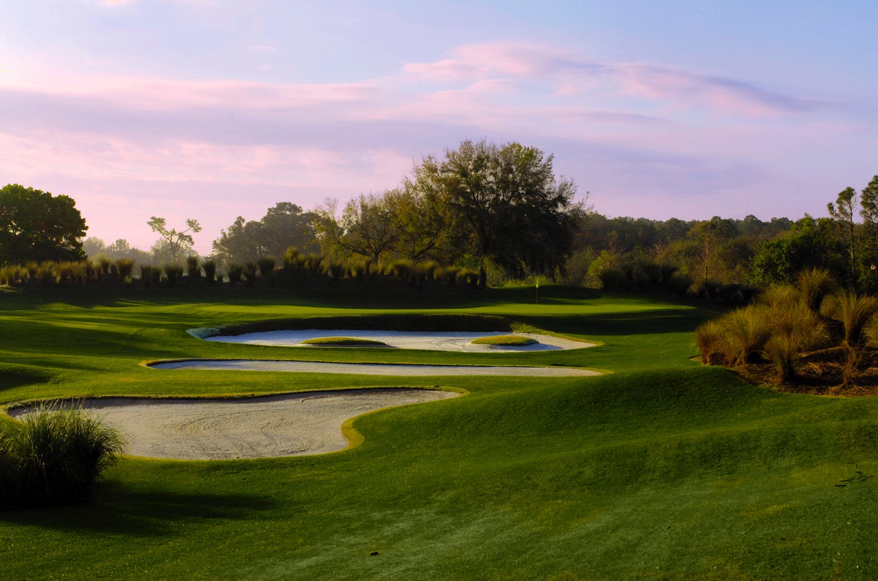
The architecture is set up as a series of events and apparatus — a golf jungle gym. The hole structures and hazard placements have everything to do with pure golf strategy, while thoughts about how the course relates to the landscape — old agricultural land next to Disney World in southwest Orlando — are largely inconsequential. The ornate landscaping is there to take your eyes off of what lies beyond.
In fact there’s nothing natural looking about the design, not that it crossed many minds in the early ’80’s to build courses that looked like they sprouted organically from the earth. [A renovation in 2007 took measures to soften and caress some of the harder edges.]

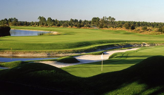
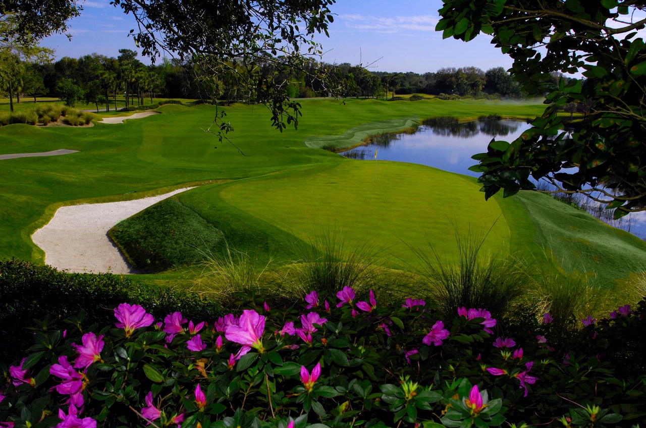
The high-contrast architecture — a lot of lakes, crisp mounding and swales, deep bunkers with steep grass faces, and segmented putting surfaces — protects Nicklaus’s small, angled and elevated greens. Some are cocked so sharply they’re nearly perpendicular to the line of play. Want to get a better look at a pin cut in a narrow back section? The fairways give you room to play wide, but you’ll have to skirt a bunker or an edge of water. Or be able to hit towering, spinning irons.

The ultra-modernist forms of Grand Cypress might seem anachronistic in an age that idolizes courses that blur the line between golf and nature, but this kind of purpose-driven design actually has deep historical roots. I respect a concept that says, “There’s the hole, and here are the obstacles in the way, and good luck.” Especially on a basically featureless sites like this one.
So many contemporary courses fall short on strategy and intrigue because they try to make up in aesthetics what the property lacks in character, especially around the green complexes. It takes rare talent and a big enough budget to get it right. And in some ways the ’80’s did have it right: over the top pre-fab is preferable to neutered naturalism, as long as you have focused strategies, serious hazards and complex greens. Golf is a sport, after all. (89)
Grand Cypress Resort-North/South/East Course
Orlando
Architect: Jack Nicklaus
Year: 1984 (North and South), and 1986 (East). North and South Course renovated in 2007
