What’s Wrong With Augusta?
Ah, it’s that time of year—the flowering trees, the treacly theme music, crippling pollen and the lamentation of everything Augusta National gets wrong with its golf course.
For many historians and a large sector of architectural observers, criticism of all that Augusta National has lost or surrendered over the decades, including the original design intent of Bob Jones and architect Alister MacKenzie, has become a rite of spring. Opinions flare about what the golf course could and rightly should be, which is to say, something other than it currently is.
Ron Whitten’s recently published feature in Golf Digest asked a number of prominent golf course architects to weigh in on how they would attempt to improve the golf course. The answers were all interesting and several were inspired, but the common theme among those brave enough to answer (many designers took a pass, largely, I’m guessing, due to politics rather than strong beliefs) is that there are clearly areas where the club has erred in how it presents its property. Remedies were at the ready.

None of the world’s legitimately great courses get picked on, analyzed or second guessed as much as Augusta National. The club opens itself up to this type of critique by undertaking its own kind of self-surgery on a regular bases, often in paradigm shifting ways. In a constant effort to better the course for the Masters, the patrons or for agronomical reasons, the course is constantly under the knife.
Few serious architectural thinkers (at least from where I sit and listen) believe all or even most of the changes and tweaks have been for the best (many can barely contain their contempt). But therein lies the issue: the best for whom? Or for what?
Tom Doak suggested that restoring MacKenzie’s wrap-around green at the 9th would reintroduce strategy and options to an otherwise one-dimensional hole. But then, in typical Doak fashion, he cuts through to the underlying truth of the matter.
“To the club’s credit,” he says, “they know what their mission is. It’s the Masters, not the preservation of MacKenzie architecture.”
This point, which I first wrote about a number of years ago, is fundamental: Augusta National cannot be viewed through any other lens than as a venue for the Masters. The architecture, whatever it is in any given year, is there to serve the sole purpose of creating challenging, consistent and, ideally, exciting tournament golf.
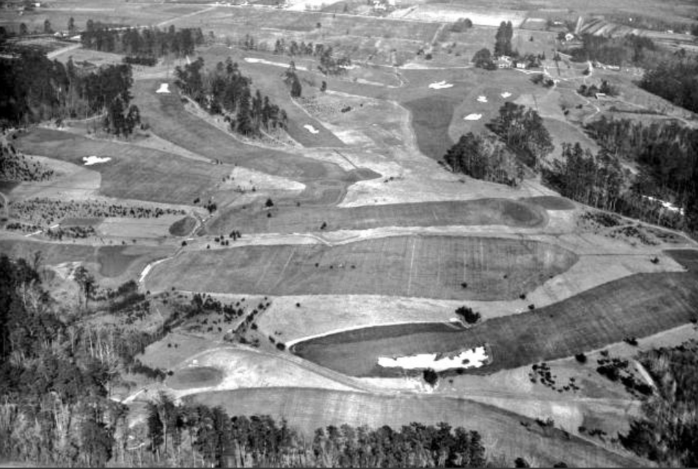
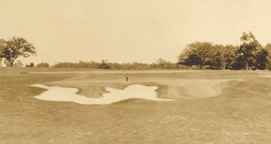
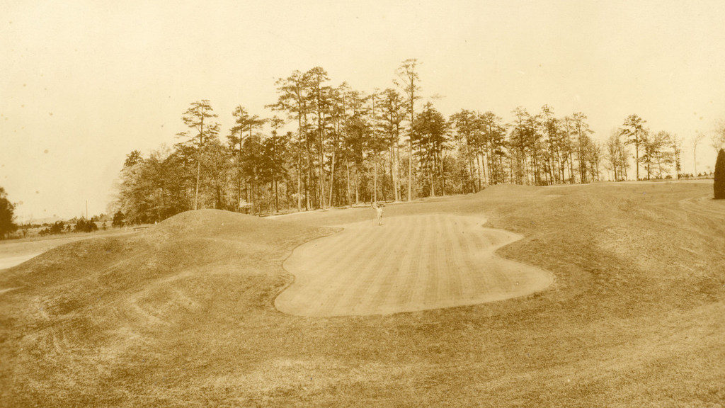
That doesn’t stop the old, grainy photos from being brandished every year showing what the course looked like when it first opened, prompting both amazement and anger that the architecture first laid out by Jones and MacKenzie has become so emphatically extinct.
It’s well documented that the two men envisioned the Augusta course to be an ambitious design—one of the country’s best, the World’s Wonder Inland Golf Course, as MacKenzie called it—featuring holes patterned after the finest links golf concepts found in the UK.
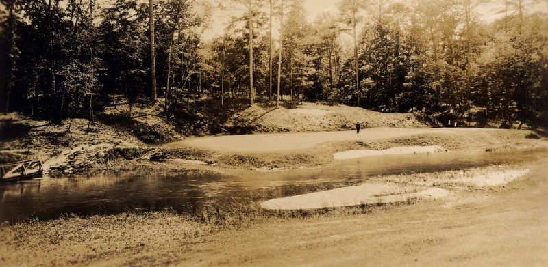
Those original holes appear positively alien compared to the scenes we’ve become accustomed to in our lifetimes. They possess a wild, rudimentary appearance against barren backdrops and diminutive pines. The bunkers are chunky and grassy. The green shapes look strangely out of proportion, with odd lobes and runway tongues sliding down to grade.
Mounds were built near greens to emulate seaside dunes, along with smaller knobs that would kick balls in random directions like undulating links turf. Many of the holes had direct British antecedents, like the par-3 4th and par-4 5th (the Eden and the Road Hole from St. Andrews, respectively). The fairways were open, the greens were extravagantly contoured and it was expected many approach shots would be played along the ground.
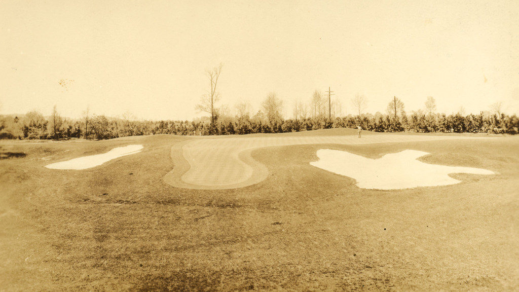
There is something hypnotic about the rough, proletariat spirit conveyed in these photos, especially juxtaposed against the controlling, fairytale perfection that now defines the course. But much of the architecture, for all its retro-cool vibe, is also bizarre, Dada, experimental. There’s a place for that in golf, but probably not on golf’s most visible and serious stage, presented to engage the world’s greatest players.
Here’s where any argument to restore the MacKenzie features at Augusta National falls apart—it wouldn’t be suitable to the Masters. It would likely be disastrous.
Bob Jones realized this almost immediately. His own observations combined with feedback from competitors after the first Masters in 1934 (Jones was always open to suggestions about how to “improve” the course) motivated him and Cliff Roberts to begin initiating changes.
By the end of the decade, after a series of significant hole alterations and green rebuilds by Perry Maxwell, the initial experiment was over. A hilly, moist, clay-based site in Georgia with primitive warm season grasses was not the location to try to replicate Scottish links concepts. Nor were those features the means by which to contest champion level golf.
But something just as good, if not better for the Masters, had taken its place.
By the mid-1950s most of the major changes to Augusta National’s original design, including the complete remodeling of the 11th and 16th holes, were complete (the 8th green was stripped of its surrounding mounds in 1956 and wasn’t rebuilt until the late 1970’s). This period is when the course’s—and arguably the Masters’—lasting identity was forged.
After finally getting the architecture more or less in balance with the property and the demands of the contemporary professional game, and with the assistance of the newly televised tournaments, Augusta National became revered as a shooter’s paradise, arguably the game’s greatest theater for testing the professional player’s ability to dissect angles, hit to precise targets, control the ball, process decisions under extreme pressure and execute a series of true and daring shots—at least if he wanted to win.
That’s not to say MacKenzie’s original design didn’t assist these qualities. His routing, use of natural features and the spaciousness through the holes all remain elemental to the brilliance of the design. But Augusta National took this premise and expanded it—and modified it—to help maximize the interest in a tournament that was creating increased national, and later international, enthusiasm.
Augusta National is ideal for what it’s designed to do, which is to captivate attention, provide drama and produce a champion who has boldly navigated it physically and psychologically—and usually a foe who has not. It’s done that from Palmer and Nicklaus to Norman and Ballesteros to Mickelson, Schwartzel, Scott and Garcia.
As such, one could argue the changes the club has made to the golf course have been deft at achieving a continuity of emphatic results. The Masters is rarely boring.
Others might argue that the fundamental structure of the course has grown so strong—fundamentals that crystalized in the 1950s—that it is immune from architectural blundering.
The real dilemma, to be fair, is not 1934 vs. 2019 but something closer to 1999 vs. 2019, the year the club began taking steps to “Tigerproof” the course.

The criticism here is more valid. The tree planting that began in the 2000’s, notably on 7, 11, 15 and 17, cheapens the design. It introduces an element of restriction that never before existed, certainly not during the course’s heyday from around 1970 through the late 1990s.
The generic plantings along the right side of the 11th hole seem tragic considering the former width of that fairway. But the cloistering effect of the added pines on 7 and 17 are more offensive, completely erasing the roles they used to play by now forcing contestants to thread cautious drives on what had always been shortish, sporty, swing-hole par-4’s.
Eleven, on the other hand, always was a difficult hole—any player in the field would gladly take four fours there if offered Thursday morning. Modern equipment, 320-yard drives and a 70-yard wide fairway, however, threatened to make it obsolete. While saddening, the added trees, by putting more pressure on the drive, help maintain the 11th’s historic integrity—not as one that gives players options but as one of the course’s most demanding par-4’s and a critical gateway before the second nine’s scoring run.
From the aesthete’s perspective—in a vacuum—the golf course is not being presented in its ideal format and an element of shwashbucking has been given up. And in another time and place, one in which 370-yard carries off the tee weren’t looming on the horizon, the new trees and first cut of rough would be removed.
But like great Renaissance and Baroque masterworks that were painted by and meant to be observed by candlelight, and yet now hang in bright and crowded museum halls, Augusta National’s current presentation serves a greater good, its own greater good—the Masters.
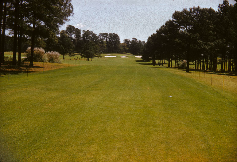
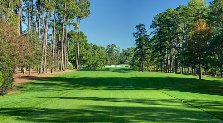
The course’s architecture may not be optimal but it’s optimized. It’s ability to defend itself with slick contour, angles and psychological pressure has been neutered by unchecked advancements in technology.
Were there alternative choices that could have been made to preserve the pre-Tiger architecture without making the course vulnerable to complete domination? Perhaps, but maybe not. Whether we care to admit it, there’s a scoring range at the Masters we’d all like to see kept relevant.
So, understanding that Augusta National’s mission now, as it was then, is to put on what many consider the finest sporting event in the world, it may be time for historians, commentators and architecture types to stop invoking the loss of Jones’ and MacKenzie’s “original intent.”
However that lost original intent is defined, it wasn’t and isn’t necessary to produce great tournament golf.
That intent hasn’t existed in any real way for almost 80 years anyway, unless that strictly means wide corridors and angles, which, for the most part, still exist. And the paradox of continuing to invoke original intent is that Jones himself was instrumental in removing and replacing it. Jones’ course wasn’t victimized by others. That must be acknowledged.
So what’s wrong with Augusta? To answer you must ask, what’s wrong with the Masters? For most people tuning in, the answer is “not much.” And while some sense of lost architectural purity may be offended, I’m guessing we’ll all be tuning in on Sunday.
And that’s kind of the whole point.
One Reply to “What’s Wrong With Augusta?”
Masterful thinking and writing. While lamenting what was lost from the original Mackenzie design, Mr Duncan encapsulates all that was gained in modern relevance and challenge.